


Achieve Illustration System
A scalable illustration system reboot designed for speed, consistency, and adoption
When Achieve rebranded (from Freedom Financial), illustrations became the missing piece of the visual language. Teams across the org were filling the gap with stock art and one-off styles—creating inconsistency, weak differentiation, and slow production. We built a centralized illustration system: a house style (north star) + reusable rules, components, and templates so any team could ship on-brand visuals faster.
At a glance
Project
Illustration System — unified style + scalable library for cross-team, multi-channel use
My role
Visual Designer, Brand — Project Co-Lead (style direction, system rules, library foundations, rollout enablement)
Core partners
Product Design (co-lead), Brand Design, Communications/Brand; stakeholders across Growth Creative, Product/UX, Web, Lifecycle, Marketing, Mobile Apps
The challenge
Inconsistent illustration usage across teams created brand drift, slower production, and a generic “stock fintech” feel
What I delivered
Core illustration style (north star) + decision-making principles
System rules (color roles, depth/layering, line treatment, environments, metaphor guidance)
Tiered library model (low/medium/high complexity)
Shared taxonomy (Icon → Emblem → Pictogram → Spot → Hero)
Templates + guidelines to support self-serve adoption
Governance foundations (request/review workflow and scalability plan)
Where it’s used
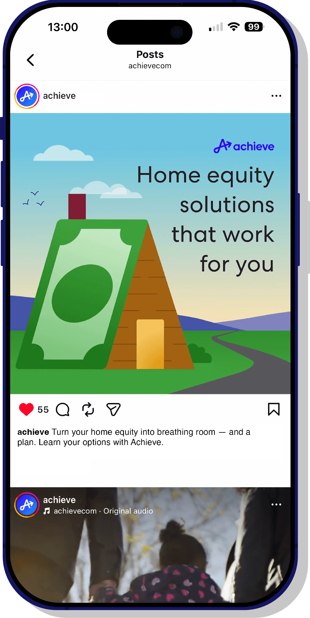
Product UI + cross-product journeys, web/landing pages, mobile, lifecycle marketing, social/paid, corporate communications, presentations, employer brand, photo + illustration pairings
Impact
400+ unique illustrated assets created and used across departments
100% adoption across digital product experiences
Reported 30% improvement in project efficiency
Reported 98% stakeholder satisfaction for consistency/visual appeal
Tools
Figma; Adobe Creative Suite (Illustrator, Photoshop, InDesign, After Effects, Premiere Pro); HTML/CSS
Skills demonstrated
Design systems thinking, brand consistency at scale, cross-functional alignment, documentation + enablement, governance, production efficiency
My role
Visual Designer, Brand (Project Co-Lead) — led illustration style direction, system rules, and library foundations; partnered cross-functionally to operationalize governance and adoption.
Team & collaborators:
Elyas Beria
Brand Design, Project Co-Lead
Elise B.
Product Design, Project Co-Lead
Nicole V.
Comms + Brand Design
Plus stakeholders across Growth Creative, Product/UX, Web, Lifecycle, Corp Comms, Marketing, and Mobile Apps.
The challenge
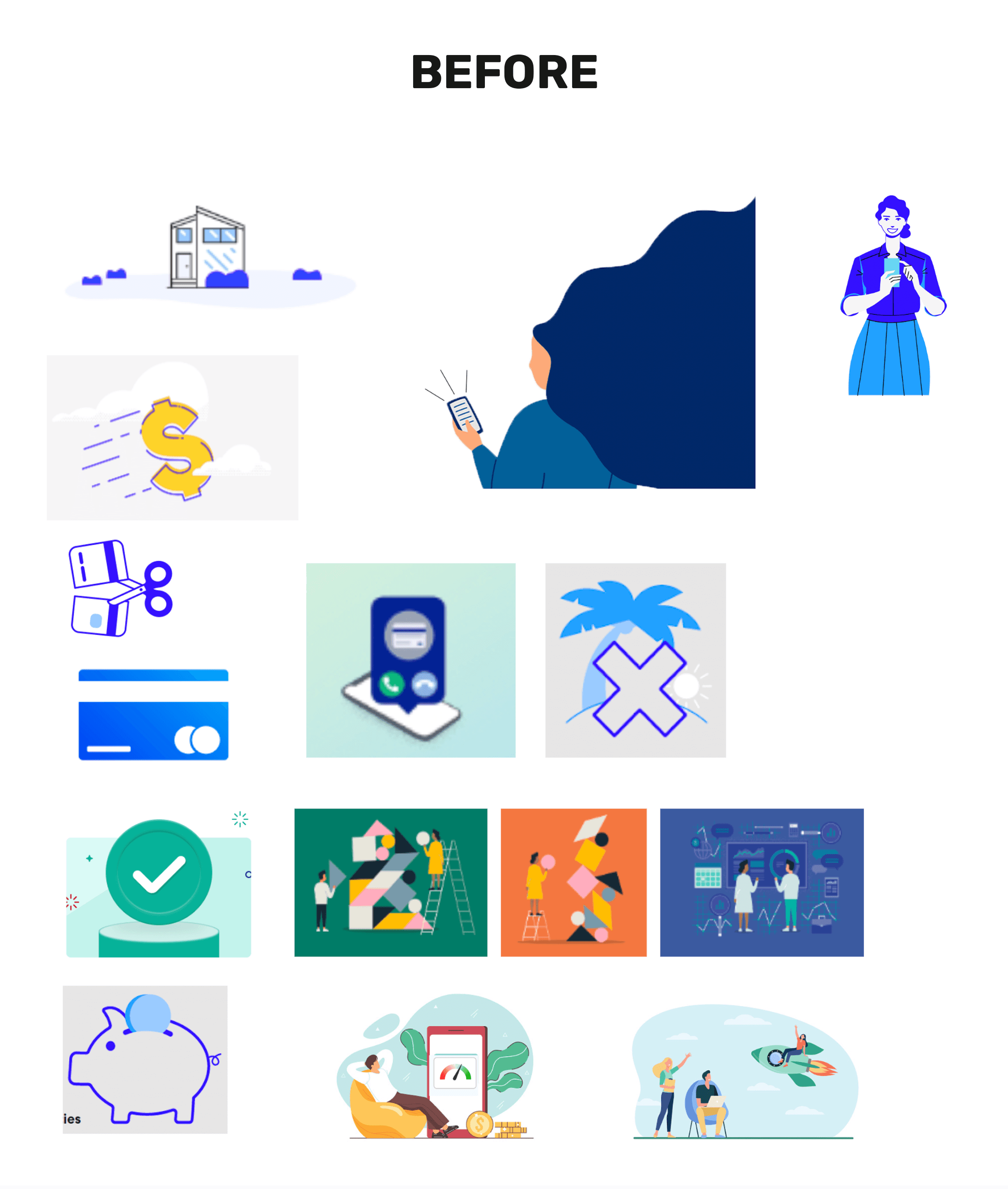
Achieve offers digital financial solutions (debt relief, personal loans, home equity). During the brand transition, core identity elements were evolving (logo, typography, voice), but illustration had no unified direction—despite being needed everywhere: product flows, Achieve.com, mobile apps, lifecycle marketing, social, comms, employer brand, and photo pairings.
Without a centralized style, illustrated assets drifted across teams and touchpoints—different palettes, inconsistent rendering, mismatched metaphor language, and uneven quality. The result:
Inconsistent illustration style, tone, and quality across channels and teams
Low differentiation (generic “fintech stock illustration” look)
Inefficiency (rework, unclear feedback cycles, repeated custom requests)

Goals & success criteria

We defined success as a system that is ownable, repeatable, and easy to adopt:
Create a cohesive, recognizable house style across all Achieve touchpoints
Establish shared vocabulary so requests/reviews are consistent
Deliver a scalable library teams can use at different sizes and timelines
Publish guidelines + templates so the system can be applied without a gatekeeper
Implement request + review flow to keep quality high as the library grows
What I delivered
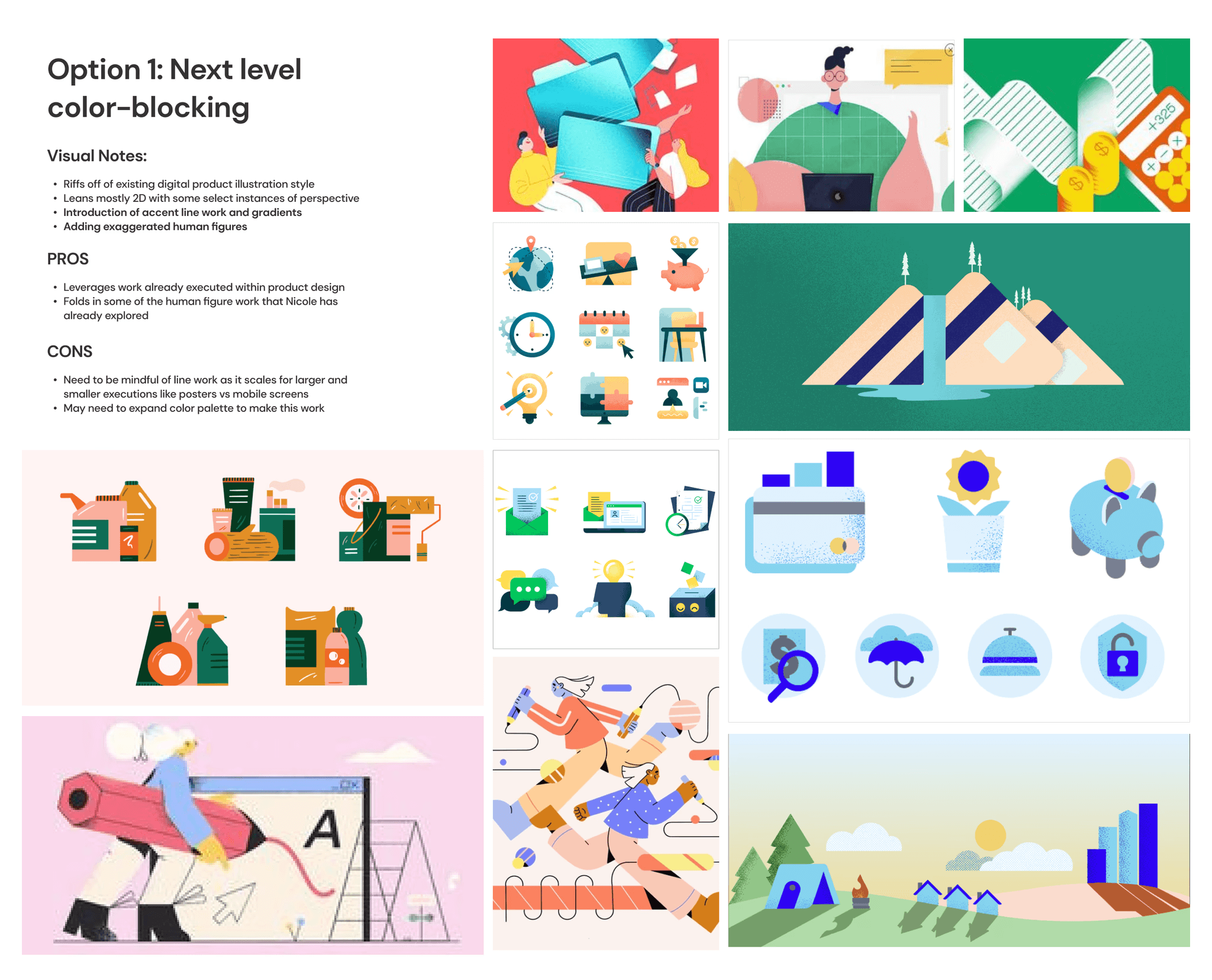
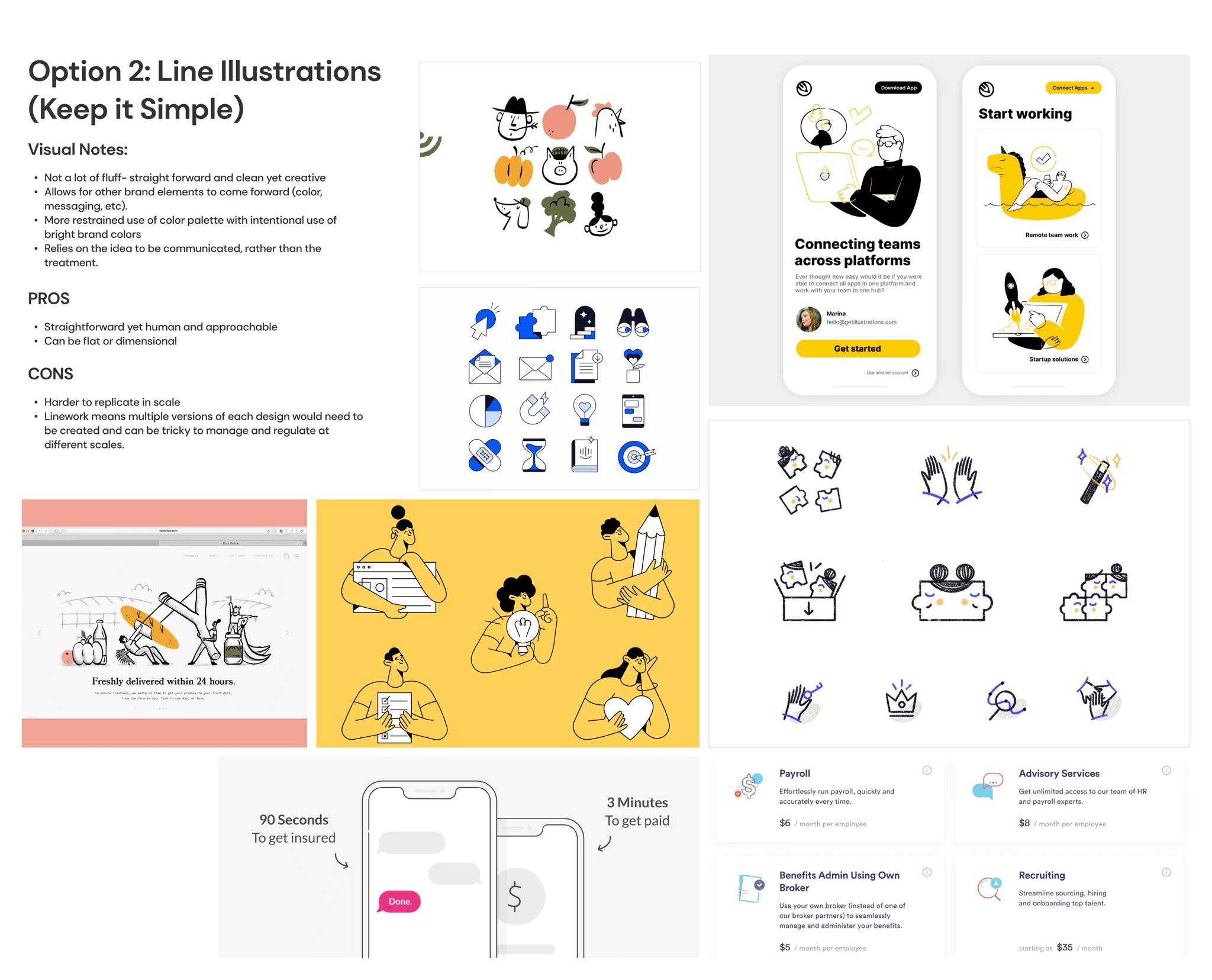
House Style (the north star)
We defined a single, durable illustration direction that could act as Achieve’s north star across product, marketing, comms, lifecycle, employer brand, and web. The goal wasn’t a one-off campaign look—it was a recognizable style that multiple designers could apply consistently, without quality drift.
We translated brand traits (clear, supportive, modern, trustworthy) into concrete visual decisions—then codified them so the system could scale across teams, timelines, and use cases.
House style attributes we optimized for:
Recognizable: a distinct Achieve look that holds together across channels and teams
Trust-building: clear, approachable, and supportive—without feeling childish or “fintech stock”
Scalable: designed to be applied consistently through rules, components, and templates
Flexible: works from small UI moments to large hero scenes without breaking the style
Production-ready: built for repeatability, speed, and easy adoption by the wider org


System rules: how the visual language is constructed
Instead of “make it feel like Achieve,” we documented specific, repeatable decisions—so the style could scale beyond one designer.
Key rules we defined and documented:
Layering & dimensionality: a consistent approach to depth and stacked forms
Environmental elements: a reusable set of scenes/background structures
Visual metaphors: a controlled metaphor system tied to brand tone and clarity
Line work: when it appears, what it communicates, and what to avoid
Color palette: how brand colors map to illustration roles (foreground/background/accent)
Human figure: guidance to keep the system consistent (with people primarily shown in photography rather than illustrated characters)
A tiered library built for real production constraints
We built the system to flex from small UI moments to full campaigns, so teams can choose the right complexity for the space and deadline. Instead of forcing a single level of detail everywhere, we defined tiers that keep the same Achieve visual language while scaling effort up or down based on format, visibility, and turnaround time. This made the library easier to adopt across the org and reduced “custom-only” requests by setting clear expectations for what belongs in a UI flow versus a high-visibility marketing moment.
Illustration tiers:
Low complexity: icons / UI support (fast to produce, clear at small sizes, reusable across flows)
Medium: spot illustrations / modules (adds context and personality while staying modular and repeatable)
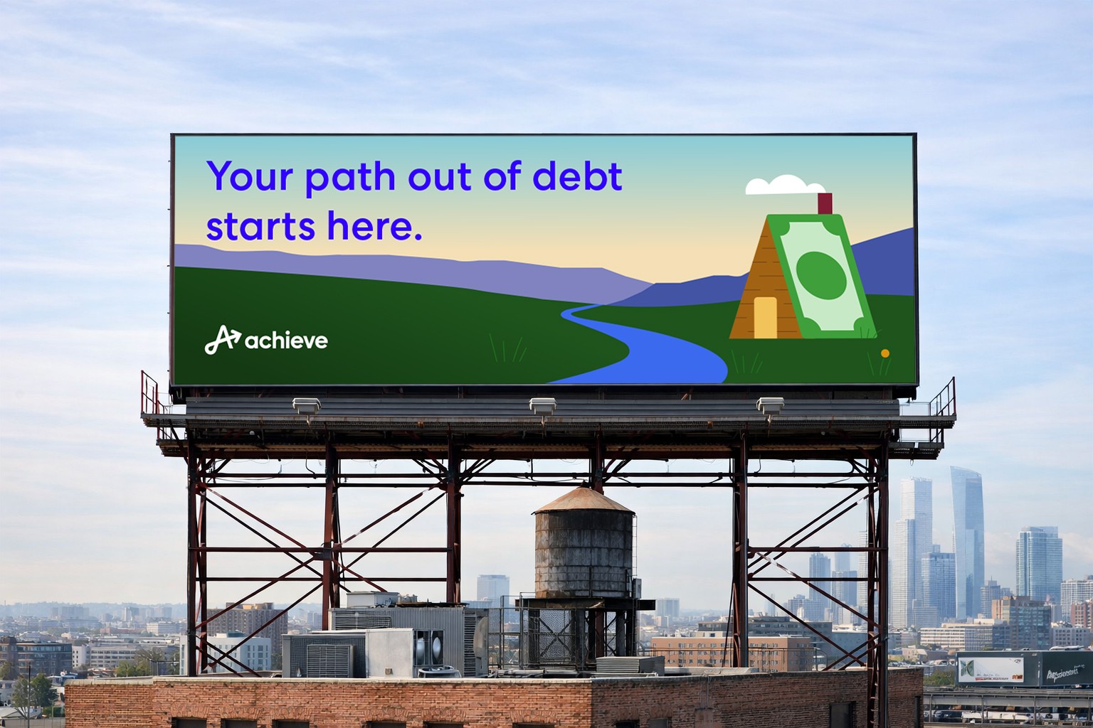
High: hero scenes / campaign moments (more narrative, higher detail, built for large formats and key brand moments)


Shared vocabulary + taxonomy
(so requests don’t break the system)
To make the system usable beyond the core team, we standardized the language people use to request, critique, and hand off illustration work. Before this, feedback was subjective (“make it more Achieve”) and requests varied wildly by team, which created scope creep and style drift. A shared taxonomy gave stakeholders a consistent way to describe what they needed—and gave designers clearer constraints for what to make.
This also helped with production planning: teams could ask for the right asset type up front (instead of defaulting to a bespoke hero), and we could map requests to the correct level of complexity, time, and review.
Core taxonomy: Icon → Emblem → Pictogram → Spot → Hero
Applying the system
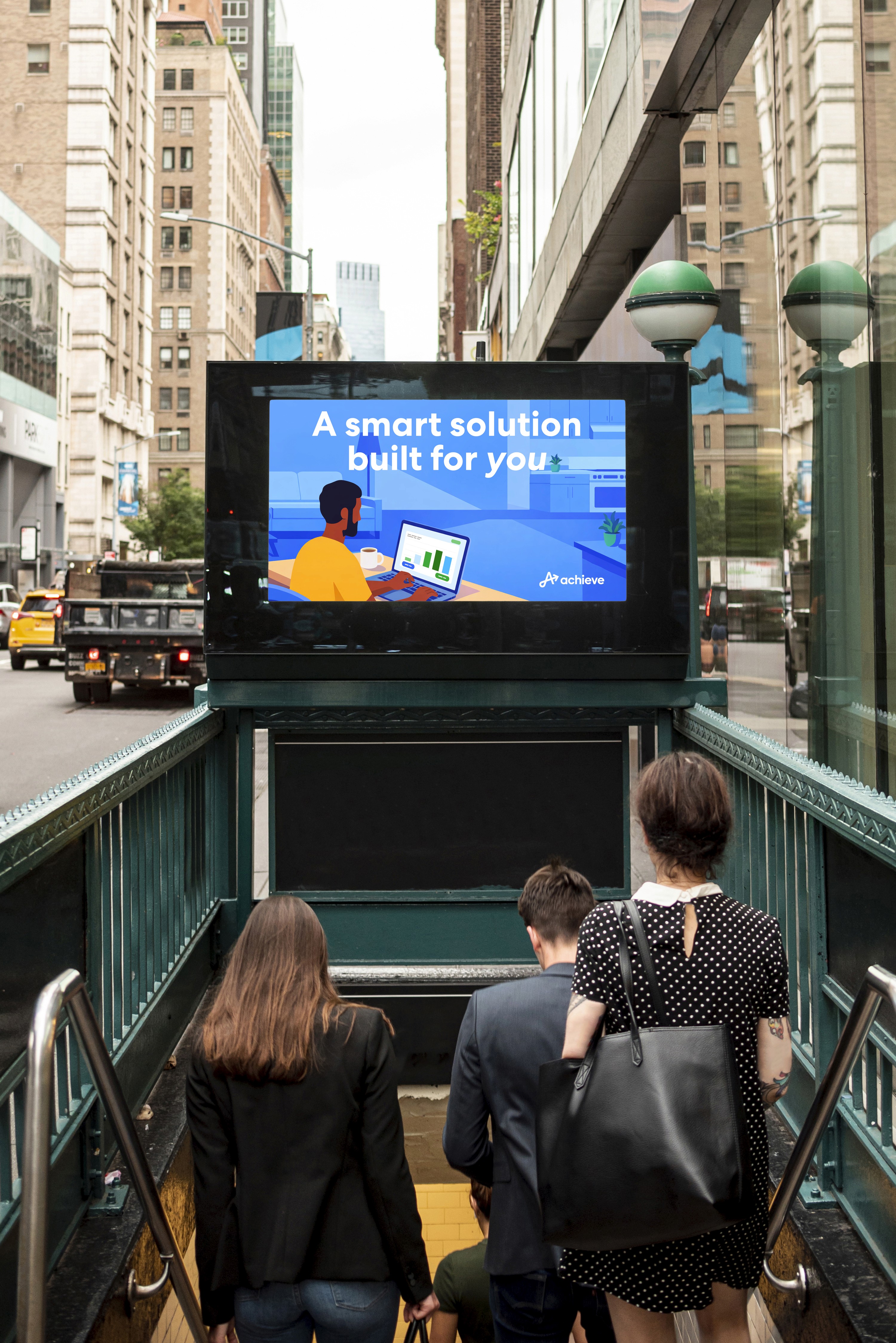
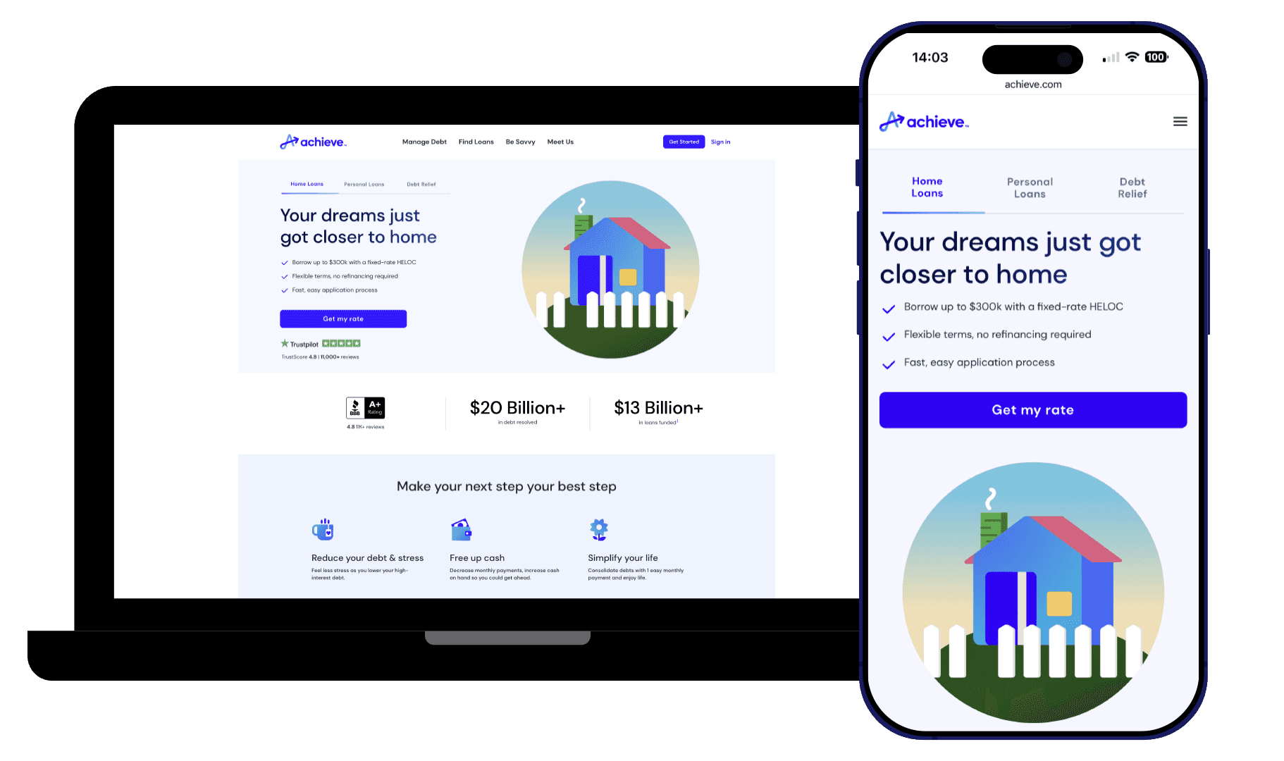
Web & Digital
On web and digital surfaces, I partnered closely with the Product Design team to ensure Achieve’s visual system—especially the illustration language—translated consistently across high-traffic pages, campaign landers, and product-adjacent moments. Together, we aligned on where the brand should feel expressive versus restrained, then applied clear rules for layout, hierarchy, and image/illustration usage so the experience stayed cohesive at every breakpoint. I also worked with stakeholders to standardize reusable patterns and an asset workflow that made it easy to launch new pages quickly while keeping quality, clarity, and brand consistency intact.

Presentations & Narrative Storytelling
Presentations were a critical place to make the Achieve story feel human and consistent—often the first time someone encountered the brand in a longer-form narrative. I worked with Marketing and Product partners to ensure the illustration system could scale beyond campaigns and live comfortably inside decks, where pacing, clarity, and repeatability matter. We defined when illustration should lead (concept slides, section openers, emotional moments) versus when it should support information (product explainers, process flows, proof points), then documented practical rules for composition, color usage, and pairing illustration with typography.
To make this usable day-to-day, I helped translate the illustration language into a modular library and a set of repeatable slide patterns—cover pages, dividers, explainer layouts, and proof slides—so teams could build decks quickly without visual drift. The result was a presentation system where illustration wasn’t decoration; it functioned as a consistent narrative tool that simplified complex ideas, reinforced tone, and kept storytelling aligned across teams and contributors.
All channels
This system was built to support the way Achieve actually ships work: multiple teams, multiple formats, and multiple speeds. Rather than relying on one “hero” use case, we designed the illustration language to be channel-agnostic—consistent enough to feel unified, but flexible enough to fit everything from small, functional moments to high-visibility brand storytelling.
The key outcome is portability: the same core rules, components, and visual decisions can be applied across product surfaces, marketing and lifecycle content, corporate communications, employer brand, and web—without reinventing style choices each time. That makes the system easier to adopt, easier to maintain, and faster to scale as new needs emerge.
Multi-product flows
Achieve.com + landing pages
Mobile + digital apps
Lifecycle marketing (email/SMS)
Social templates + paid social
Comms + presentations
Employer brand + recruiting
Photography + illustration pairings


Process (how we aligned and shipped)

We treated the illustration system like a product rollout—not a one-time style exploration—because the real risk wasn’t choosing the wrong look, it was building something teams couldn’t consistently use. The work needed to align stakeholders across product, marketing, communications, web, lifecycle, and employer brand, then translate that alignment into rules, templates, and a library that could scale without constant oversight.
Discovery
We audited existing illustration usage across channels to pinpoint where inconsistency and quality drift showed up (palette shifts, mismatched rendering, unclear metaphor language, uneven complexity). In parallel, we aligned with cross-functional partners on success criteria and adoption requirements: where the system needed to work first, the most common request types, and what would make the system self-serve (shared vocabulary, tiering, and clear guidelines).
Early design explorations
We developed multiple stylistic directions and evaluated them against Achieve’s brand attributes (clarity, trust, modernity, support). Exploration focused on scalable decisions—shape language, depth rules, color roles, line treatment, and repeatable scene-building components—so the eventual direction could work at both UI and marketing scales.
Research & feedback
We built structured feedback loops with stakeholders to keep critique tied to consistent criteria rather than personal taste. We also validated that metaphor choices stayed clear and credible for a financial context. This phase produced two outputs: a single north-star direction stakeholders could support, and a prioritized list of “system rules” required to prevent drift as usage expanded.
Finalize & systemize
Once the direction was set, we shifted from aesthetics to infrastructure: codifying rules, defining a tiered complexity model, and establishing shared taxonomy (Icon → Emblem → Pictogram → Spot → Hero). We packaged the system for adoption with documentation, templates, and a request/review workflow—so teams could produce on-brand work quickly while keeping consistency high.
End result: clearer direction, faster production, and consistent visuals across teams—supported by documentation and governance, not just individual taste.
Rollout & governance
A system isn’t done when it’s published—it’s done when it’s adopted and maintained.
Rollout plan:
Finalize principles + component rules
Build a starter library (icons, spots, modules, heroes)
Publish guidelines + templates
Pilot in 2–3 high-visibility channels, then expand
Establish review + maintenance cadence

Results

Post-launch, the system drove adoption and reduced friction for teams shipping across channels:
400+ unique illustrated assets created and available across departments (and growing)
100% adoption across digital product experiences
Reported 30% improvement in project efficiency (fewer bespoke requests, faster turnaround)
Strong stakeholder sentiment (reported 98% satisfaction for consistency/visual appeal)
Results reflect internal adoption and production tracking during the rollout period.