

Achieve — Brand Identity System & Scalable
Visual Language
Achieve is a digital personal finance company and the rebranded consumer identity of Freedom Financial Network, a 20-year business whose visuals lacked cohesion across teams and channels. The move to Achieve required more than a new name; it demanded a modern, trustworthy system that could roll out consistently across web, campaigns, presentations, and high-visibility moments. I joined the Brand team to implement the rebrand by creating the brand style guides and partnering with Marketing and Product to scale execution across touchpoints.
Role: Visual Designer, Brand
Focus: Rebrand rollout, brand system + style guides, cross-channel brand execution, vendor direction.
Tools: Figma, Adobe Creative Suite (Illustrator, Photoshop, InDesign, After Effects, Premiere), HTML/CSS

The Challenge
Freedom Financial Network had been around for two decades, but its branding didn’t reflect that maturity. Visual identity was inconsistent across teams and channels, assets were often created as one-offs, and there wasn’t a central system to enforce cohesion.
As the company rebranded to Achieve, the work needed to do more than look new—it needed to function as a scalable foundation for a modern, trustworthy consumer brand.
The challenge was to operationalize the Achieve identity: codify the rules, establish repeatable patterns, and collaborate across teams and partners so the brand could roll out quickly and stay consistent across web, marketing, and storytelling surfaces—without creating friction for day-to-day production.
Objectives

The work centered on a single imperative: implement the Achieve rebrand across priority surfaces quickly and without drift. That meant establishing a brand system that could scale across channels and teams, creating style guides clear enough that anyone could execute from them, and building reusable patterns and templates that reduced one-offs without sacrificing hierarchy or craft.

My Role and Collaboration
Brand Visual Designer operating within a cross-functional team spanning Marketing and Product. Responsible for translating brand strategy into a cohesive, scalable visual system while maintaining consistency across a growing set of surfaces and deliverables.
Defined and implemented the core identity system, including typography, layout, iconography, and illustration usage. Developed and maintained brand guidelines to enable consistent execution without ambiguity. Established the photography direction and built a structured, reusable image library. Designed and delivered assets across web, campaigns, social, presentations, and events. Managed brand asset systems to ensure consistency across internal teams and external partners.
Worked closely with Product Design and Marketing to calibrate where the brand should be expressive versus restrained. Partnered with stakeholders to review and standardize reusable patterns. Directed external vendors through clear briefs and defined constraints to maintain quality and alignment.


Approach
Define the foundations,
then make them usable
Rebranding isn't finished when the identity is approved—it's finished when teams can apply it consistently at speed. To scale a brand in real production conditions, the system needed two things: strong fundamentals and practical guidance.
Every decision reinforced that pairing. Hierarchy and disciplined layouts kept the brand clear and trustworthy. Consistent rules for typography, spacing, and imagery prevented assets from drifting as production volume grew. Reusable templates for the most common formats eliminated one-offs. And the logomark's "up and to the right" direction was held deliberately—a visual reinforcement of forward financial momentum that carried through every application.Key decisions
The System
Brand Style Guides
To keep execution consistent across teams, I created and maintained brand style guides that codified the identity into clear, repeatable rules. The guides covered typography hierarchy and usage patterns, layout and spacing principles, iconography style, and illustration guidelines including composition, color usage, scale, and placement. Do/don't examples were included throughout to give teams a concrete reference for where the identity could flex and where it couldn't.
View Style Guide
Applying the system
Web & Digital
On web and digital surfaces, I partnered with Marketing and Product Design to ensure the Achieve rebrand translated into a cohesive, modern experience—consistent hierarchy, disciplined layouts, and a unified approach to imagery.
We aligned on repeatable page patterns (hero, value props, proof points, explainer modules, CTAs) so the brand could scale across landing pages and campaigns without becoming a collection of one-offs.
This collaboration supported fast iteration while protecting quality: reusable modules, clear rules for typography and spacing, and consistent QA to ensure the experience stayed on-brand across breakpoints.


Presentations & Narrative Storytelling
Presentations were a high-leverage channel for telling the Achieve story clearly—aligning leadership and cross-functional teams, explaining products and programs, and supporting campaign narratives.
I worked with partners to translate the Achieve identity into a deck system with consistent hierarchy, layout rhythm, and reusable slide patterns so decks could be produced quickly without visual drift.
By standardizing core slide types—openers, dividers, explainers, and proof points—teams could create new narratives faster while keeping a consistent Achieve voice across contributors and use cases.
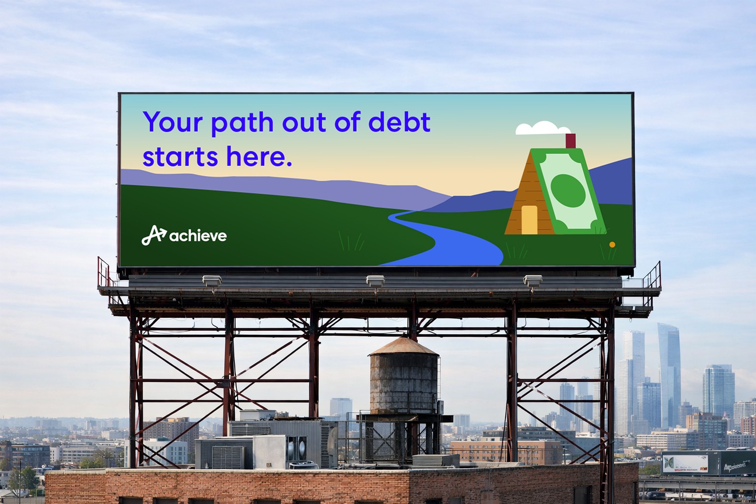
Campaigns, Social, and High-Visibility Moments
As the Achieve rebrand rolled out, campaigns and social became the fastest-moving proof point of the new identity. The work had to land consistently across high-volume formats—paid and organic social, lifecycle moments, and campaign toolkits—while still leaving enough flexibility for different messages, audiences, and placements.
I partnered with Marketing stakeholders to translate the brand standards into repeatable creative patterns (headline hierarchy, layout behavior, imagery treatment, CTA conventions) so assets could be produced quickly without becoming a collection of one-offs.
High-visibility moments raised the bar even further: the brand needed to hold up at scale and in public-facing placements where clarity, craft, and consistency are non-negotiable.
I ensured the Achieve system carried cleanly into large-format executions by applying disciplined typography, strong hierarchy, and brand-consistent composition—so the identity felt unmistakably Achieve whether viewed on a phone screen or at distance in a major placement.


Evolving the Brand (Later System Additions)
As Achieve matured, additional systems were introduced to support new storytelling needs and increase production efficiency. This included expanding structured libraries (such as illustration/iconography) as the brand’s touchpoints and content demands grew.
Achieve Illustration System Case Study
Vendor Direction and Asset Governance
To protect consistency as the system scaled, I managed brand asset libraries and partnered with vendors using clear briefs and review checkpoints. Keeping assets organized and standards documented reduced drift and helped teams execute faster with confidence.

Outcomes
The Achieve rebrand was rolled out cohesively across major touchpoints, replacing previously fragmented legacy branding with a unified visual system. Consistency and production speed improved through the introduction of reusable patterns, templates, and comprehensive brand guidelines. This system established a scalable foundation that supported continued growth and expansion into new channels without compromising visual quality or craft.
