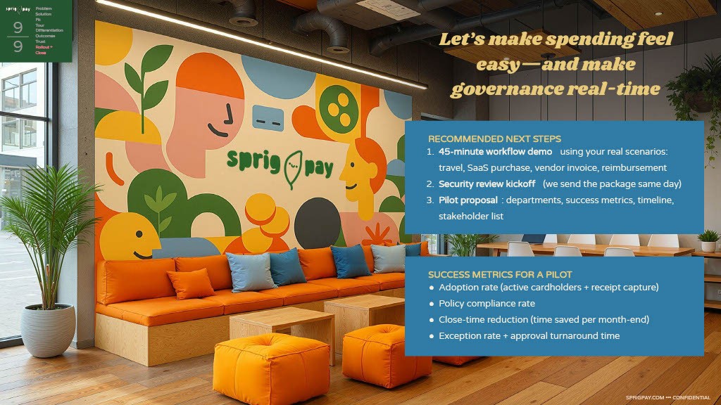
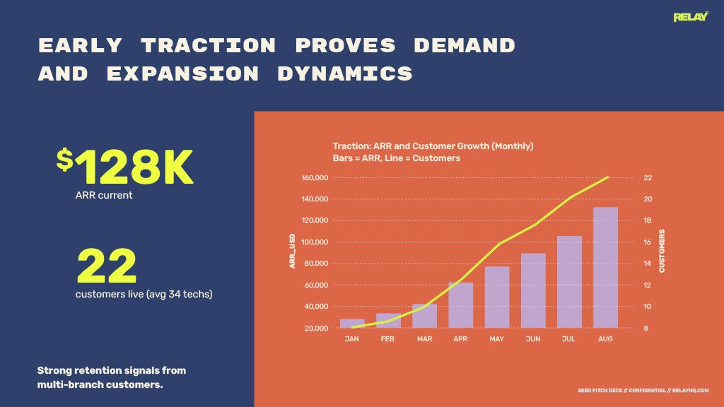
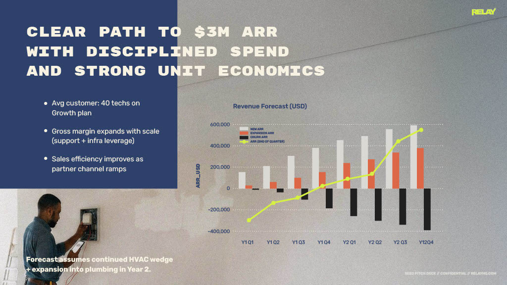
The work shown here includes both completed decks and reusable deck templates—built to stay consistent as teams iterate and scale. I design presentation decks as systems, not just slides. Each deck is built to communicate clearly under pressure—whether that’s a boardroom, a sales call, an investor pitch, or an internal rollout.
My focus is on narrative structure, visual hierarchy, and brand integrity, ensuring every slide earns its place and moves the audience forward.
What these decks demonstrate
Narrative clarity
Strong decks guide an audience, not overwhelm them.
I structure presentations with a clear arc—problem, insight, proof, outcome—so ideas land quickly and build logically slide to slide.
Headlines do real work. Supporting content is intentionally restrained. The result: slides that can be skimmed, presented, or shared async without losing meaning.
Visual hierarchy under real constraints
These decks are designed for real-world use:
Executives scanning slides on a laptop
Sales teams presenting live
Stakeholders reviewing PDFs without narration
Typography, spacing, color, and layout are used to prioritize information instantly, ensuring key messages surface first—every time.
Brand systems applied to presentations
Presentations are often where brands break.
These decks show how a brand system holds up when applied to:
Dense information
Data and diagrams
Long-form narratives
Mixed audiences
I translate brand guidelines into flexible presentation systems—with repeatable layouts, modular components, and clear usage patterns—so decks stay consistent even as they scale.
Decks and templates designed for reuse and iteration
Slides are built to be edited, expanded, and reused by teams after handoff—whether delivered as a full deck or a template system.
That means:
Clear layout logic
Predictable spacing rules
Components that adapt without redesigning every slide
This approach reduces one-off work and keeps decks polished long after the initial delivery.
My role
Across these projects, I was responsible for:
Visual direction and layout systems
Typography and color strategy
Deck component and template design
Visual storytelling and pacing
In many cases, this work also included aligning stakeholders on structure and flow before a single slide was finalized.
Why this matters
A strong deck doesn’t just look good—it changes how information is understood and decisions are made.
These presentations show how I use design to:
Reduce cognitive load
Strengthen brand perception
Support confident storytelling
If you’re looking for a designer who treats decks as a strategic communication tool—not decoration—this work reflects how I approach the problem.
Types of decks and templates represented here
Pitch and fundraising decks
Enterprise sales and enablement
Product and platform storytelling
Brand and strategy presentations
Template systems for repeatable storytelling and brand consistency
Each example reflects the same design principles—clarity, hierarchy, and system thinking—applied to different business goals.


