Scalable Illustration System for Achieve
A centralized house style and illustration system that improved consistency, reduced bespoke production, and helped Achieve scale illustration across teams and touchpoints.
During the rollout period, the system supported more than 400 unique illustrated assets, 100 percent adoption across digital product experiences, a 98 percent stakeholder satisfaction rate related to consistency and visual appeal, and a 30 percent reduction in bespoke illustration requests due to the availability of a comprehensive library.


The win was not just a larger asset library. The work replaced scattered one-off illustration with a repeatable system, created stronger alignment across teams, improved clarity and quality across channels, and made illustration easier to request, produce, and keep consistent over time.
When Achieve rebranded from Freedom Financial, illustration became a missing part of the new visual language. Teams across the organization were filling that gap with stock art and one-off styles, creating inconsistency, weak differentiation, and slower production.
My Role
Visual Designer, Brand — Project Co-Lead
I co-led the development of the illustration system, leading style direction, system rules, and library foundations in partnership with Product Design and cross-functional stakeholders responsible for adoption across the business.


The Challenge
Achieve needed illustration across product flows, Achieve.com, mobile and digital apps, lifecycle marketing, social, communications, employer brand, and photo pairings, but there was no unified direction guiding how that work should look or scale.
Without a centralized style, illustration drifted across teams and touchpoints. Color use varied, rendering styles were inconsistent, metaphor language lacked discipline, and overall quality was uneven. The result was a fragmented experience, lower differentiation, and unnecessary production friction.

What We Built
The goal was not to create a one-off campaign style. It was to establish a house style that could serve as the north star for a scalable illustration system.
We set out to build a system that could create stronger brand differentiation, reinforce trust and consistency, and improve production efficiency across teams. To work in practice, it needed to be recognizable, repeatable, and flexible enough to support a wide range of channels, formats, and timelines.

Product flows (multi-product experiences)

Achieve.com + landing pages

Mobile + digital apps

Lifecycle marketing (email/SMS)

Comms + presentations

Employer brand + recruiting

Photo + illustration pairings
What I Delivered
House Style
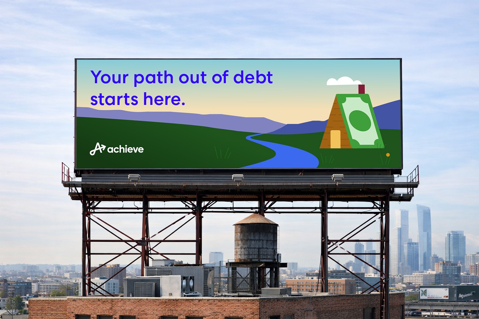
At the center of the system was a single illustration direction that could act as a north star across product, marketing, communications, lifecycle, employer brand, and web. The objective was to create a recognizable Achieve look that multiple designers and teams could apply consistently without quality drift.
I translated Achieve’s brand traits into concrete visual decisions and codified them so the style could scale in practice. The work was designed to feel clear, human, supportive, and trustworthy while avoiding the generic look common in fintech illustration. It also needed to flex from small functional moments to larger narrative scenes without losing coherence.


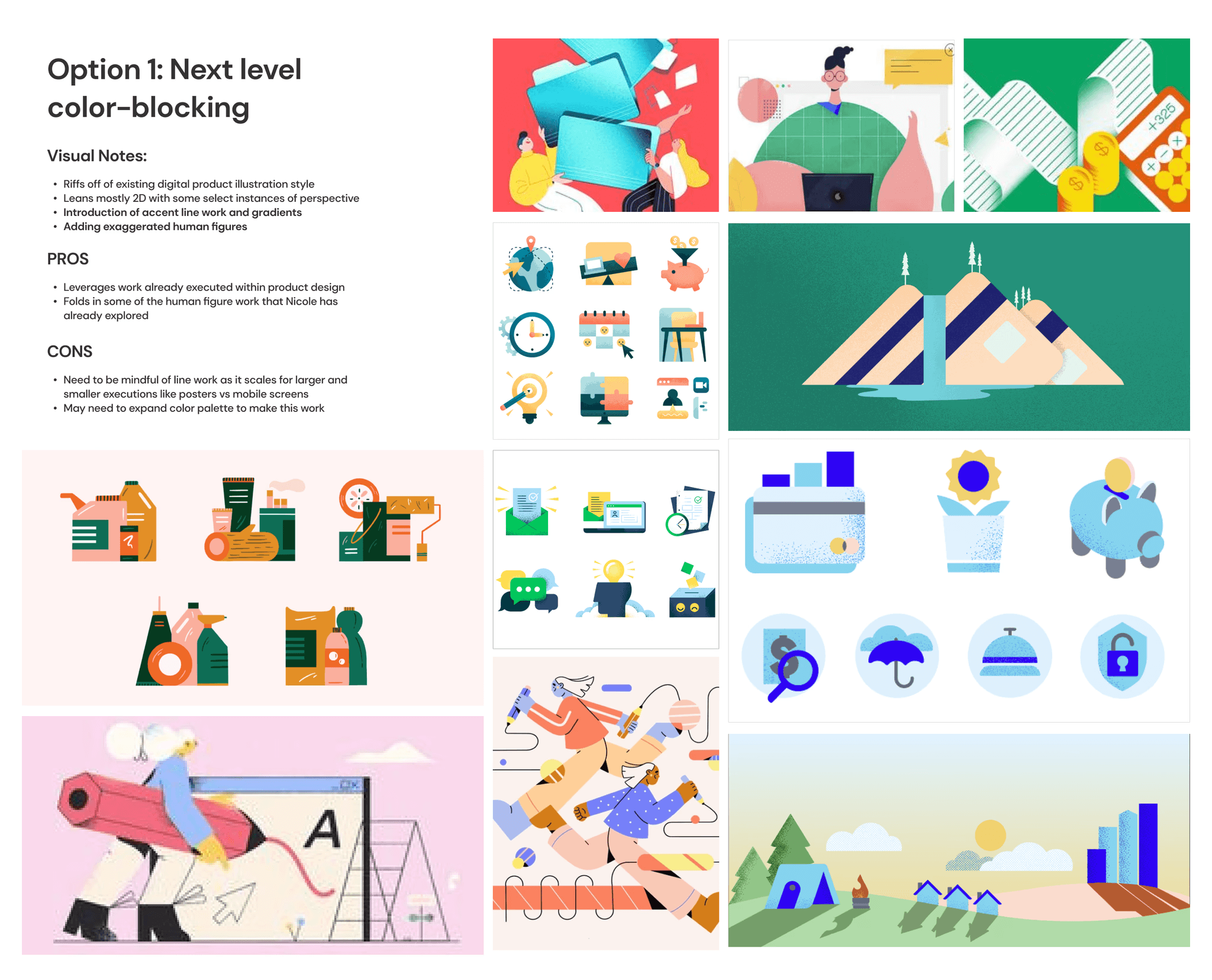
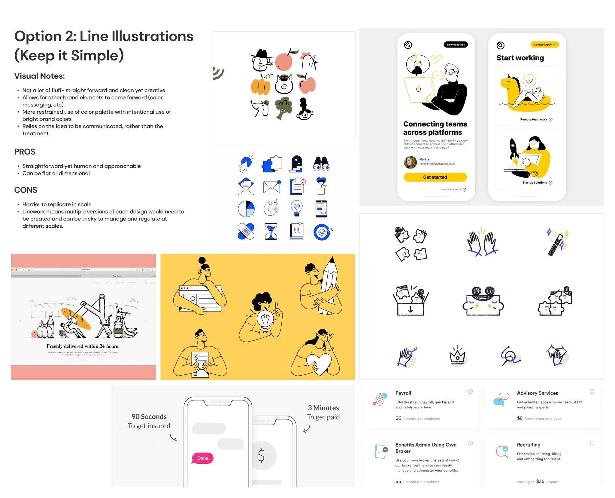
System Rules
To make the style usable beyond intuition, we documented specific visual rules rather than relying on subjective direction. These rules defined the core logic of the visual language, including layering and dimensionality, environmental elements, visual metaphors, the role of line work, color palette, and guidance for how human presence should appear in the system. In practice, this made the work more repeatable and less dependent on any one designer’s judgment.

Tiered Library
We built the library to work across real production constraints. Instead of forcing one level of detail into every context, we defined a tiered system that could scale complexity up or down depending on message, space, and turnaround time.
The system included lower-complexity assets for icons and UI support, mid-level assets for spot illustrations and modules, and higher-complexity hero scenes for larger storytelling moments and campaigns. This made the system easier to adopt and reduced unnecessary bespoke requests by clarifying what level of illustration belonged in which context.

Shared Vocabulary and Taxonomy
A system only works if people know how to ask for the right thing. To make requests, reviews, and handoffs more consistent, we standardized the language used to describe illustration needs. Terms such as icon, emblem, pictogram, spot, and hero created a shared vocabulary for discussing asset type, complexity, and purpose. This reduced subjective feedback, helped stakeholders request the right asset type up front, and gave designers clearer constraints around timing and use case.

Applying the System
A key part of the work was proving that the system could function across the way Achieve actually ships work: across multiple teams, formats, and speeds.
On web and digital surfaces, I partnered closely with Product Design and stakeholders to apply the illustration language across high-traffic pages, landing pages, and product-adjacent moments. In product and multi-product experiences, the system was designed to flex from small UI moments to broader journey-level communication.
In presentations and communications, I helped translate the illustration language into modular assets and repeatable storytelling patterns. The same visual logic was also designed to travel across lifecycle marketing, social, employer brand, and photography pairings without reinventing style decisions each time.


Process and Rollout
We approached the illustration system as a rollout problem as much as a design problem. The challenge was not just choosing a style, but building something teams could adopt and maintain.
The work began with an audit of illustration usage across channels. From there, we aligned on principles with cross-functional partners, explored stylistic directions, gathered feedback, incorporated research, established the house style, and translated those decisions into toolkits, libraries, and guidelines. This sequence helped move the work from visual exploration into practical infrastructure that teams could use in day-to-day production.


Outcomes
Post-launch, the system improved adoption and reduced friction for teams creating work across channels.
Results during the rollout period included more than 400 unique illustrated assets created and made available across departments, 100% adoption of the illustration system across digital product experiences, a 98% stakeholder satisfaction rate related to consistency and visual appeal, increased alignment with Achieve’s brand identity through internal stakeholder surveys and external user research, and a 30% reduction in bespoke illustration requests due to the availability of a comprehensive library.
The result was not just a library of illustrations. It was a scalable visual system that helped Achieve create faster, more consistently, and with stronger brand cohesion across teams.

Social templates + paid social