Custom Typeface and Typographic System Studies
Typeface studies that sharpen precision, hierarchy, and system thinking across brand and visual design
The value of this work is not just in making typefaces. It strengthens the judgment that carries into brand systems, editorial layouts, presentation design, and digital experiences by developing a deeper sensitivity to structure, spacing, rhythm, and internal logic.
Rather than treating typography as surface styling, this work focuses on the underlying decisions that make a visual system feel coherent, readable, and refined.


What This Work Develops
Sensitivity to form and proportion
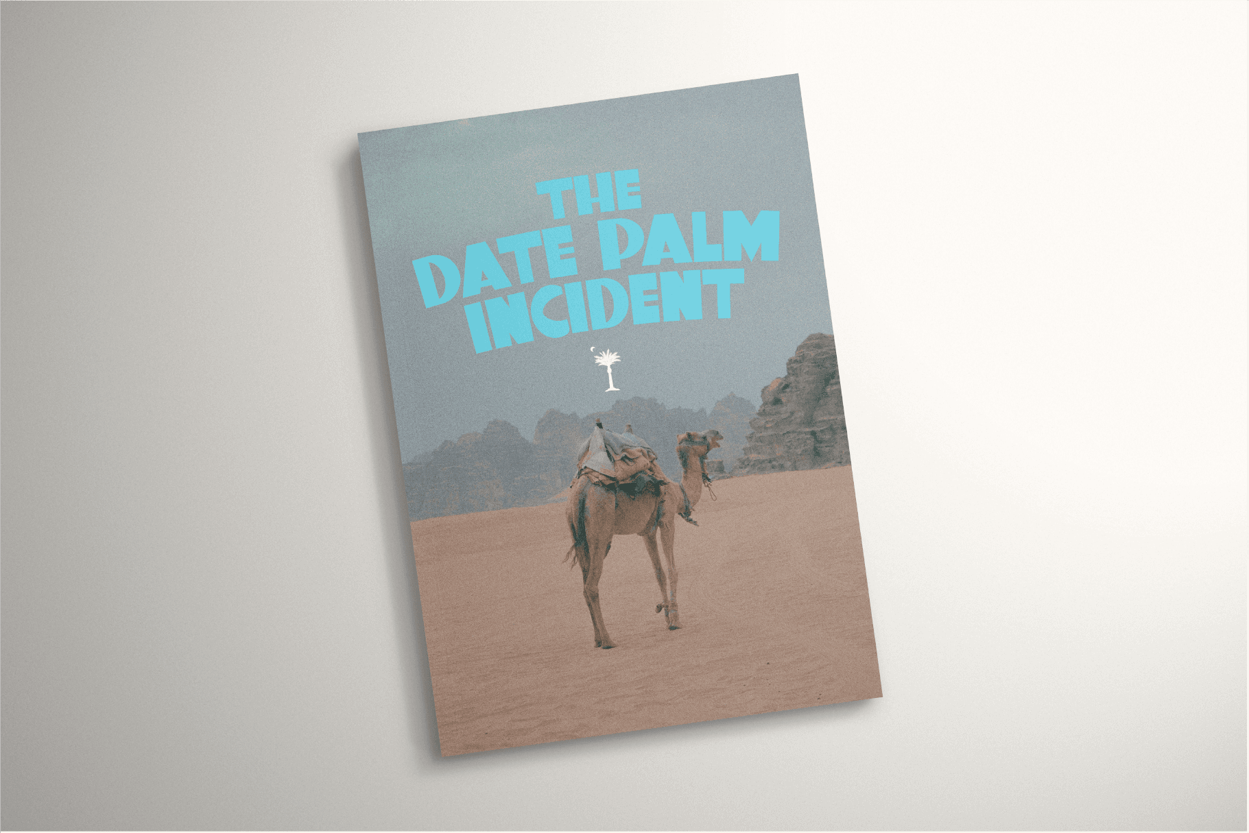
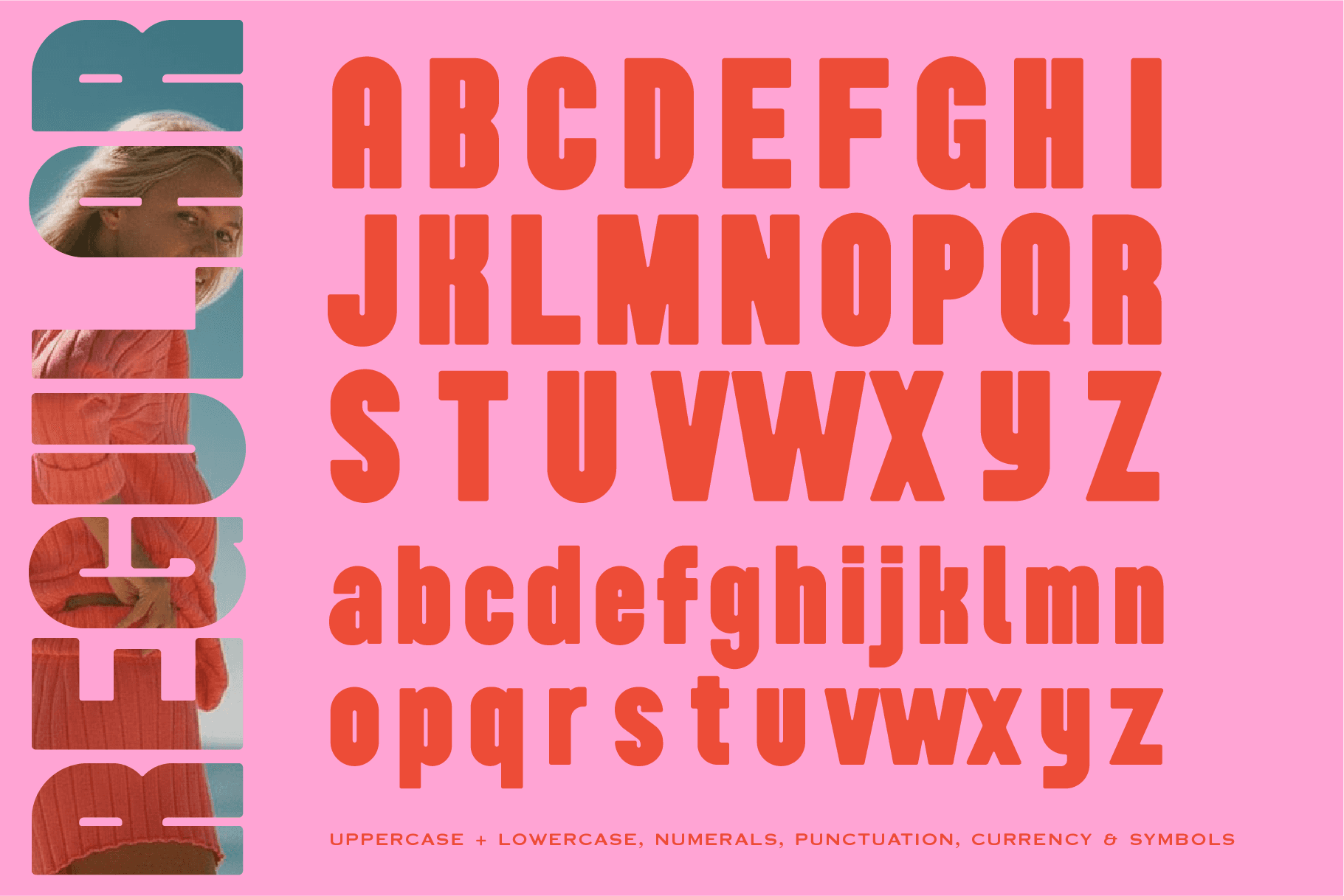
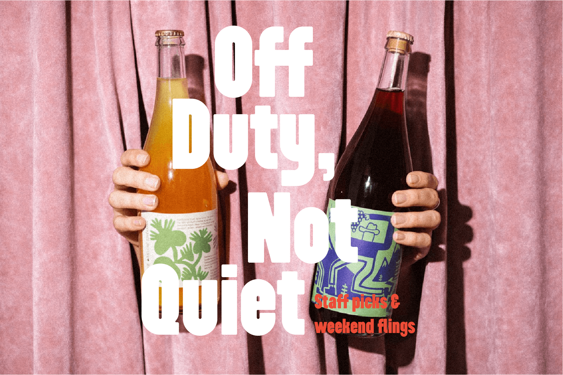
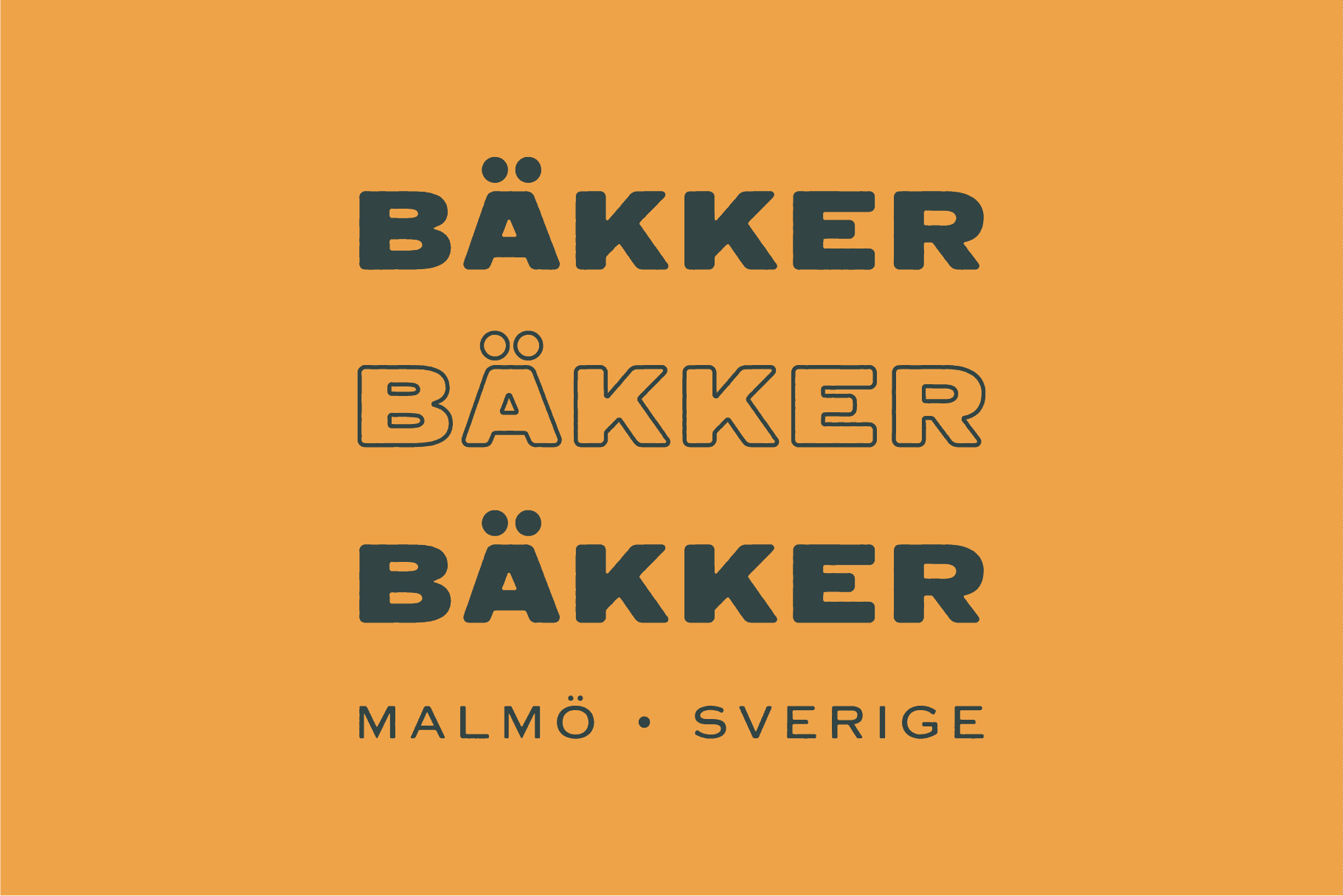
Designing letterforms sharpens how I evaluate shape, balance, and visual rhythm. Small adjustments can change how a character feels, how a word holds together, and how a system performs as a whole. That sensitivity carries into broader design work through cleaner layouts, more disciplined hierarchy, and typography that feels intentional rather than simply applied.
Iteration as a design discipline
Type design is inherently iterative. Progress comes through drawing, testing, revising, and refining until the system holds together across different characters, weights, and contexts. These studies reflect that process and reinforce a disciplined approach to refinement that applies directly to brand and visual design work.


System thinking at the smallest scale
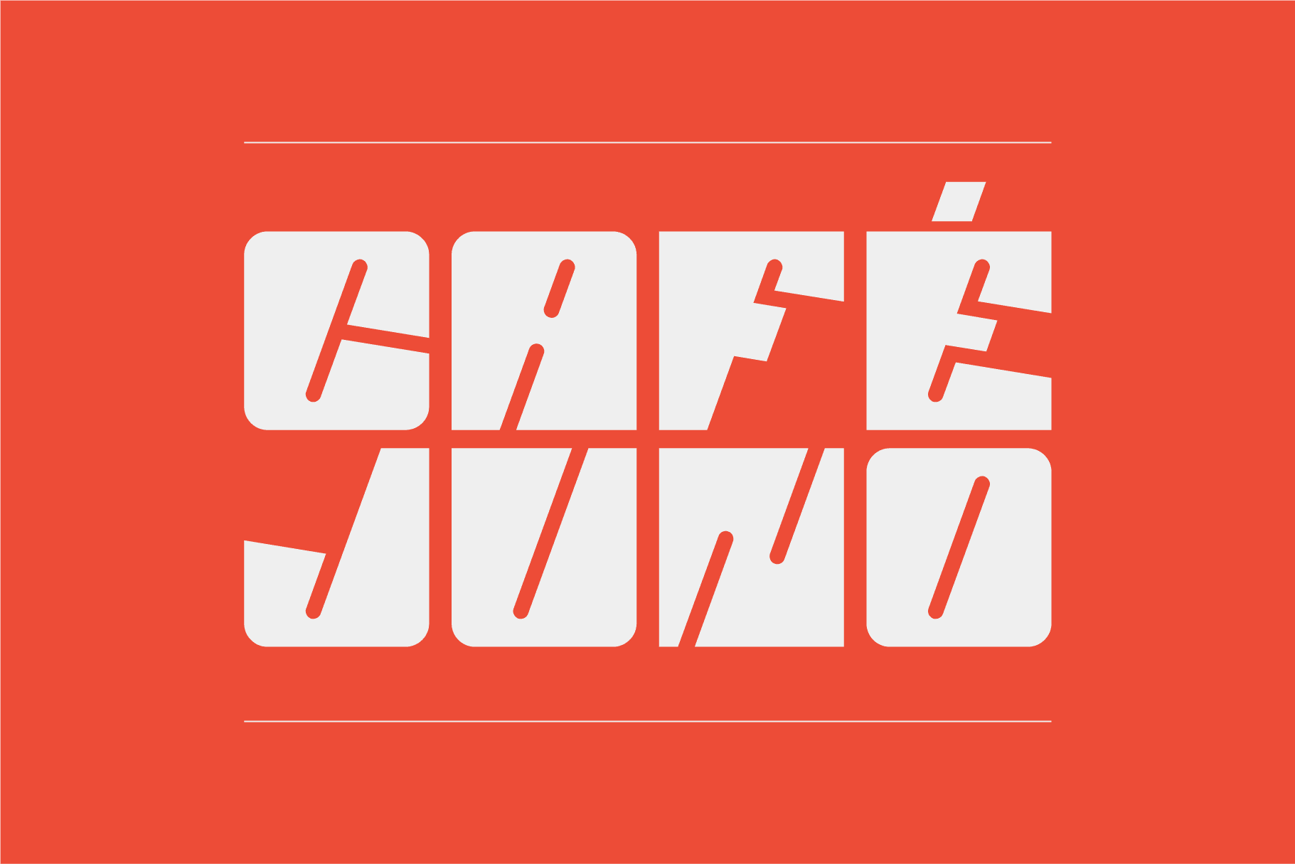
A typeface only works when its internal logic is consistent. Decisions made in one glyph affect the rest of the alphabet, which requires clear rules, repeatable relationships, and close control of variation. This kind of small-scale system thinking maps directly to larger design systems where consistency, scalability, and cohesion matter.
Attention to spacing and rhythm
Much of typographic quality lives in spacing, weight distribution, and optical balance. Working at this level builds a stronger instinct for readability, pacing, and visual density, all of which directly inform layout, brand, and interface design.
Constraint-driven creativity
Type design operates within strict constraints of legibility, balance, and repetition. Within those boundaries, subtle decisions create tone and character. That balance of structure and expression reflects the same kind of thinking required in brand and digital design, where systems need to be flexible without losing coherence.


Why This Matters to My Broader Practice
Typography underpins nearly every visual system. Working at the level of letterforms strengthens precision, consistency, and judgment across everything from brand identities to long-form layouts and presentation design.
These studies represent a deeper engagement with the foundations of visual communication, and they continue to inform how I approach hierarchy, pacing, and system-building across my broader design practice.