Brand Identity System & Scalable Visual Language for Achieve
A scalable brand system that turned a new identity into a usable framework for everyday execution across product, marketing, sales, and customer-facing touchpoints

The value of the work was not just the identity itself. It gave Achieve a clearer visual foundation, replaced one-off decisions with reusable rules and patterns, improved consistency across teams and channels, and made the new brand easier to apply in real business contexts.
Achieve is a financial services brand launched from the rebrand of Freedom Financial Network, whose previous visual identity was inconsistent and lacked a clear, scalable system.
My Role
Visual Designer, Brand
I led the development of the brand identity system and helped shape how the new Achieve brand could function consistently across real business applications. My work included foundational visual rules, broader system logic, illustration direction, iconography, documentation, and application across key touchpoints.


The Challenge
Achieve was a new brand, but for it to work in practice it needed more than a new name or visual direction. It needed a system that could carry the brand consistently across product, marketing, presentations, and other customer-facing materials.
Freedom Financial Network’s previous visual identity had been inconsistent and lacked a cohesive system, creating an opportunity to build stronger visual foundations from the outset and translate the rebrand into something operational.


What I Built
I built the system around the core elements that support consistency at scale: color, typography, spacing, and grid. Rather than treating those decisions as purely stylistic, I defined them as practical rules that could create order across many different applications.
From there, I developed the broader visual language. That included refining the graphic system, leading the creation of the illustration system, shaping a more cohesive approach to iconography, and defining how the brand could communicate complexity without feeling visually heavy.
The goal was to create a system that felt clear and structured while remaining flexible enough to work across formats and audiences.


Applying the System
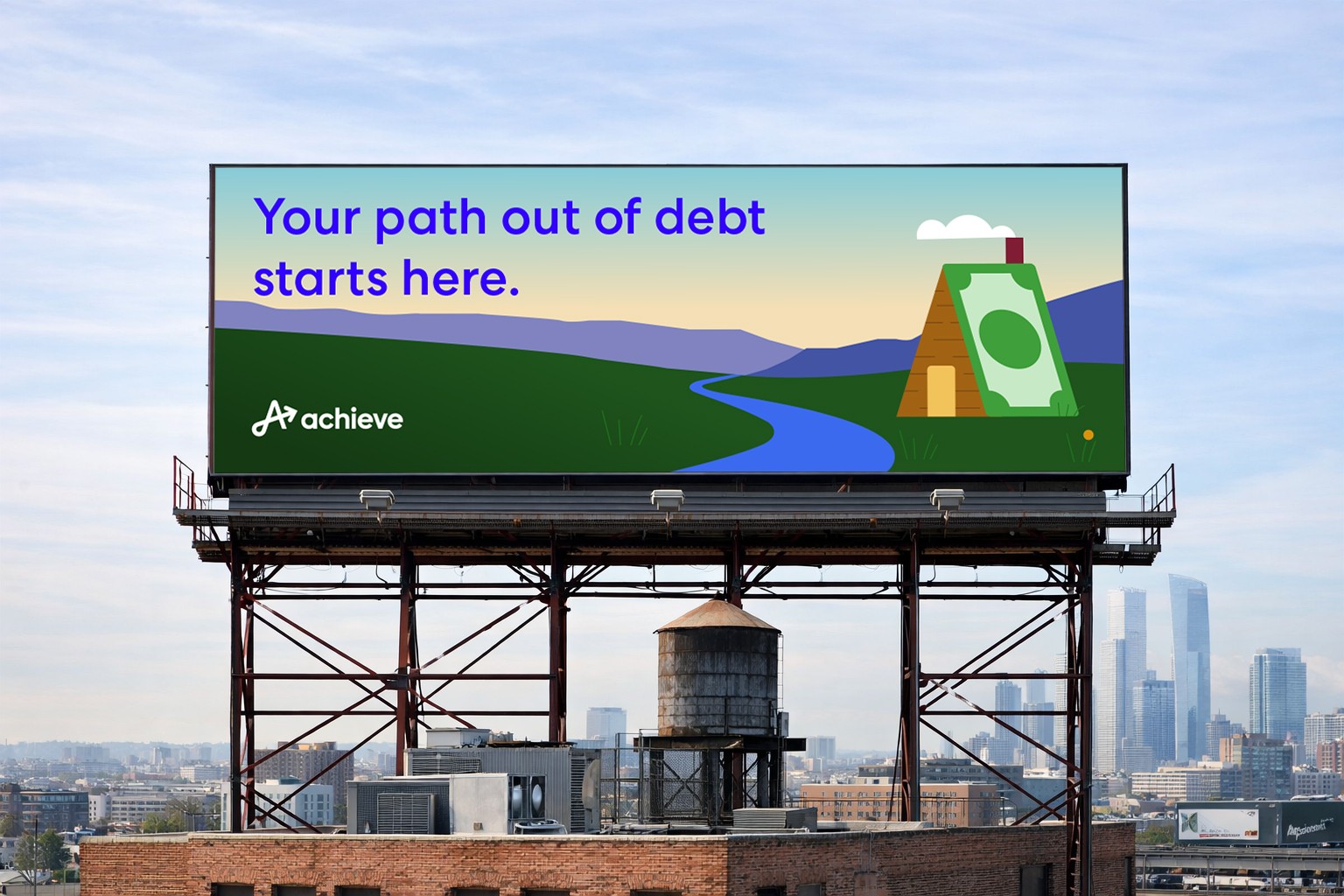
A key part of the work was proving the system through real application. I applied the Achieve brand across high-impact touchpoints including web, presentations, campaign materials, and other customer-facing expressions to ensure the identity could function consistently beyond guidelines alone.
Across web and digital, I partnered with Marketing and Product Design to bring greater hierarchy, consistency, and structure to page layouts, imagery, and repeatable content patterns. I also translated the brand into a deck system with reusable slide patterns and clearer hierarchy so presentations could be produced more efficiently and with less visual drift across teams and narratives.
As the brand rolled out across campaigns and social, I turned the standards into repeatable creative patterns for messaging, layout, imagery, and calls to action. I also helped standardize data visualization so information-heavy content felt clear, intentional, and aligned with the broader identity.


System Documentation
To support adoption, I created and maintained brand style guides that translated the identity into clear, repeatable rules. These covered typography hierarchy and usage, layout and spacing principles, iconography style, and illustration guidance including composition, color use, scale, and placement.
As Achieve matured, the system expanded to support new storytelling needs and improve production efficiency through structured libraries such as illustration and iconography. I also managed brand asset libraries and partnered with vendors through clear briefs and review checkpoints to help protect consistency as the system scaled.


Evolving the Brand
As Achieve matured, the system expanded to support new storytelling needs and improve production efficiency. This included developing structured libraries such as illustration and iconography to support a growing range of touchpoints, content needs, and internal design demands.
Vendor Direction and Asset Governance
To help protect consistency as the system scaled, I managed brand asset libraries and partnered with vendors through clear briefs and review checkpoints. Keeping assets organized and standards documented helped reduce drift and support more consistent execution across teams and partners.
Outcomes
The result was a brand system designed to support more consistent execution across product, marketing, and sales. It established a clearer visual foundation, introduced reusable patterns and guidance, and made the new brand more practical to apply across everyday work.
More broadly, the project showed how a new brand can move from rebrand intent to real-world application by building strong visual foundations, creating usable standards, and reducing friction in how teams produce and apply brand work.
